
具体描述
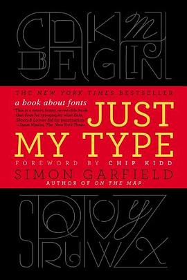
A delightfully inquisitive tour that explores the rich history and the subtle powers of fonts.
Fonts surround us every day, on street signs and buildings, on movie posters and books, and on just about every product that we buy. But where do fonts come from and why do we need so many? Who is behind the businesslike subtlety of Times New Roman, the cool detachment of Arial, or the maddening lightness of Comic Sans (and the movement to ban it)? Simon Garfield embarks on a mission to answer these questions and more, and reveal what may be the very best and worst fonts in the world.
Typefaces are now 560 years old, but we barely knew their names until about twenty years ago, when the pull-down font menus on our first computers made us all the gods of type. Beginning in the early days of Gutenberg and ending with the most adventurous digital fonts, Garfield unravels our age old obsession with the way our words look. Just My Type investigates a range of modern mysteries, including how Helvetica took over the world, what inspires the seemingly ubiquitous use of Trajan on bad movie posters, and what makes a font look presidential, male or female, American, British, German, or Jewish. From the typeface of Beatlemania to the graphic vision of the Obama campaign, fonts can signal a musical revolution or the rise of an American president. This book is a must-read for the design conscious that will forever change the way you look at the printed word.
作者简介
Simon Garfield is the author of twelve acclaimed books of nonfiction. He lives in London and St. Ives, Cornwall, and currently has a so ft spot for Requiem Fine Roman and HT Gelateria.
Chip Kidd is associate art director for Alfred A. Knopf, where his jacket designs have revolutionized the art of American book packaging. He is the author of numerous books, including The Cheese Monkeys.
目录信息
读后感
是通过《字谈字畅》认识的这本书和译者的,虽然之前也听闻过字节社和TIB(Type is Beautiful),但是对于字体的认识停留在衬线和非衬线和各个字体名字还有声名在外的Helvetica等几个西文字体。我想这可能也和中文的语境有关,但是无知并不能怪环境。 就像我们小时候最开始学一...
评分1.1 出版情况 作者【英】西蒙·加菲尔德(Simmon Garfield) 译者 吴涛、刘庆 电子工业出版社 东西文库计划 1.2 与字体有关的思想 从古至今字体使用的规范和礼节一直都存在 字体也会有性别。厚重、粗粝的字体大多数属于雄性,而多变、轻盈卷曲的字...
评分by卢涛 2011年9月,《纽约时报》畅销书榜单前十位里出现一本叫Just My Type的书,而它的副标“A Book About Fonts”告诉你,这居然是一本关于字体的书!只要随便翻看一本正常点的关于字体的书,它们都会不厌其烦地从六百年前的约翰内斯·古登堡向你扯起。而这本《字体故事:西...
评分在火车上,我看完了这本《字体故事—— 西文字体的美丽传奇》 书中介绍的很多字体,我闻所未闻,或者有些字体我见过却视如不见,毕竟,我接触西文字体的机会不多,偶尔用的字体无非只有Times New Roman和Arial(标示数字)而已,但通过阅读这本近400页的书籍,对于西方字体的发...
评分在火车上,我看完了这本《字体故事—— 西文字体的美丽传奇》 书中介绍的很多字体,我闻所未闻,或者有些字体我见过却视如不见,毕竟,我接触西文字体的机会不多,偶尔用的字体无非只有Times New Roman和Arial(标示数字)而已,但通过阅读这本近400页的书籍,对于西方字体的发...
用户评价
读完就觉得我不懂字体。“外行因为不懂,所以只区分得出brush script与arial那种巨大区别。其实字体的设计精髓在于nuances,就像葡萄酒。”
评分like it so much, amazing
评分like it so much, amazing
评分读完就觉得我不懂字体。“外行因为不懂,所以只区分得出brush script与arial那种巨大区别。其实字体的设计精髓在于nuances,就像葡萄酒。”
评分读完就觉得我不懂字体。“外行因为不懂,所以只区分得出brush script与arial那种巨大区别。其实字体的设计精髓在于nuances,就像葡萄酒。”
相关图书


本站所有内容均为互联网搜索引擎提供的公开搜索信息,本站不存储任何数据与内容,任何内容与数据均与本站无关,如有需要请联系相关搜索引擎包括但不限于百度,google,bing,sogou 等
© 2025 book.wenda123.org All Rights Reserved. 图书目录大全 版权所有