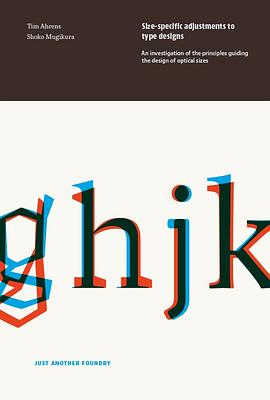

The aim of this book is to determine principles underlying the design of optical sizes, with a view to giving useful advice to practitioners who wish to design such sizes for their own fonts.
What are optical sizes?
“Optical sizes” are size-specific adjustments to type designs. They were practiced for 500 years of metal type printing. Since punches had to be cut separately for each type size, adjusting them accordingly did not involve any additional effort and the optical compensations were built into the fonts. Characters intended for use in small sizes typically show an increased width and x-height, reduced stroke contrast and looser spacing.
In phototype, size-specific adjustments were largely given up and single-master designs dominated. This practice was continued during the early years of digital type.
Why wrote this book
From the metal type era, hardly any documentation on the subject is available since punchcutting, like other crafts, was not discussed much in writing. The skills and insights were passed on from one master to the next by demonstration. Even today the design process of optically sized typefaces has rarely been recorded or analysed. This lack of resource lead Tim Ahrens to research and write about it himself in 2007, in the hope that the outcome would become a useful source for practitioners who wish to create fonts with size specific styles.
Features of this book
The book looks into type history and perception psychology, and analyses designs by old masters and numerous contemporary designers. We interviewed a number of designers such as Robert Slimbach, David Berlow, Akira Kobayashi, and Christian Schwartz. Their answers, along with the analysis of existing fonts, form an important basis for the principles explained in the book.
About the new edition
The original version of this paper was written as part of Tim Ahrens’ MA in Typeface Design at the University of Reading in 2007. The following year, it was published by Mark Batty Publisher. This first edition was produced as print-on-demand, which regrettably resulted in a very high unit price and restricted production quality. In 2013 we obtained the publishing rights and, since we have been constantly receiving requests for the book, decided to update, extend, and re-publish it ourselves.
This 2014 edition is co-authored by Shoko Mugikura, who joined extending and updating the content and designed the book.
For more about the difference from the previous edition read our blog entry.
Sample sections on Suppression and emphasis of features in typeface design and on Spatial frequencies can also be found on our blog.
具體描述
讀後感
評分
評分
評分
評分
用戶評價
相關圖書


本站所有內容均為互聯網搜索引擎提供的公開搜索信息,本站不存儲任何數據與內容,任何內容與數據均與本站無關,如有需要請聯繫相關搜索引擎包括但不限於百度,google,bing,sogou 等
© 2025 qciss.net All Rights Reserved. 小哈圖書下載中心 版权所有