Just My Type pdf epub mobi txt 電子書 下載2025
- 字體
- 設計
- 平麵設計
- 藝術
- design
- Graphic_design
- 英文原版
- 眾包翻譯
- Typography
- Design
- Language
- Culture
- History
- Art
- Communication
- Identity
- Aesthetics
- Modernity

具體描述
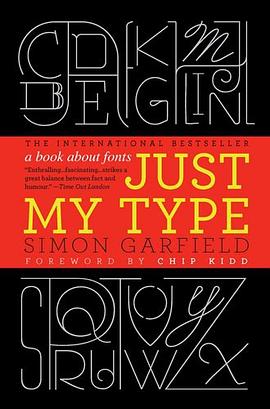
A hugely entertaining and revealing guide to the history of type that asks, What does your favorite font say about you?
Fonts surround us every day, on street signs and buildings, on movie posters and books, and on just about every product we buy. But where do fonts come from, and why do we need so many? Who is responsible for the staid practicality of Times New Roman, the cool anonymity of Arial, or the irritating levity of Comic Sans (and the movement to ban it)?
Typefaces are now 560 years old, but we barely knew their names until about twenty years ago when the pull-down font menus on our first computers made us all the gods of type. Beginning in the early days of Gutenberg and ending with the most adventurous digital fonts, Simon Garfield explores the rich history and subtle powers of type. He goes on to investigate a range of modern mysteries, including how Helvetica took over the world, what inspires the seeming ubiquitous use of Trajan on bad movie posters, and exactly why the all-type cover of Men are from Mars, Women are from Venus was so effective. It also examines why the "T" in the Beatles logo is longer than the other letters and how Gotham helped Barack Obama into the White House. A must-have book for the design conscious, Just My Type's cheeky irreverence will also charm everyone who loved Eats, Shoots & Leaves and Schott's Original Miscellany.
作者簡介
Simon Garfield is the author of twelve acclaimed books of nonfiction. He lives in London and St. Ives, Cornwall, and currently has a soft spot for Requiem Fine Roman and HT Gelateria.
Chip Kidd is associate art director for Alfred A. Knopf, where his jacket designs have revolutionized the art of American book packaging. He is the author of numerous books, including The Cheese Monkeys.
目錄資訊
Introduction: Love Letters 1
Periodic Table of Typefaces 6-7
1 We don't serve your type 9
2 Capital Offence 22
Gill Sans 41
3 Legibility vs Readability 45
Albertus 62
4 Can a font make me popular? 65
Futura v Verdana 73
5 The Hands of Unlettered Men 77
Doves 84
6 The Ampersand's Final Twist 89
7 Baskerville is Dead (Long Live Baskerville) 97
Mrs Eaves & Mr Eaves 106
8 Tunnel Visions 109
9 What is it about the Swiss? 124
Frutiger 139
10 Road Akzidenz 143
11 DIY 158
12 What the Font? 172
13 Can a font be German, or Jewish? 180
Futura 193
14 American Scottish 196
Moderns, Egyptians and Fat Faces 204
15 Gotham is Go 208
16 Pirates and Clones 220
Optima 233
17 The Clamour from the Past 235
Sabon 251
18 Breaking the Rules 254
The Interrobang 268
19 The Serif of Liverpool 270
Vendôme 284
20 Fox, Gloves 286
21 The Worst Fonts in the World 296
22 Just My Type 313
Bibliography 333
Online 337
Acknowledgements 339
Font and image credits 343
Index 345
· · · · · · (收起)
讀後感
1.1 出版情况 作者【英】西蒙·加菲尔德(Simmon Garfield) 译者 吴涛、刘庆 电子工业出版社 东西文库计划 1.2 与字体有关的思想 从古至今字体使用的规范和礼节一直都存在 字体也会有性别。厚重、粗粝的字体大多数属于雄性,而多变、轻盈卷曲的字...
評分不错的知识书,只是最好对着字体看,作者如果能把每种提到的字体都有一段就更好了 不错的知识书,只是最好对着字体看,作者如果能把每种提到的字体都有一段就更好了 不错的知识书,只是最好对着字体看,作者如果能把每种提到的字体都有一段就更好了 不错的知识书,只...
評分2011年紅遍歐美的暢銷書裏,居然有一本關於字體的故事書:《Just My Type》。本書一經出版就廣受歡迎,登上了衆多書籍銷售排行榜。在銷售熱潮和媒體推薦下,社會上生起一輪字體熱。這本書將衆多有關於西文字體的故事、插曲和八卦收集一處,通過趣味筆法講述出來。從飽受譏諷的 ...
評分在《机械复制时代的艺术作品》中,本雅明提到,早在文字能够印刷之前,木刻技术已经实现了对版画等艺术作品的复制,而后石印术和摄影术又分别二度改变了文献和形象复制领域的面貌。里头最著名的一个论述是,当现代工业技术可以轻而易举地进行制模、影印、刷版等流程操作之后,...
評分是通过《字谈字畅》认识的这本书和译者的,虽然之前也听闻过字节社和TIB(Type is Beautiful),但是对于字体的认识停留在衬线和非衬线和各个字体名字还有声名在外的Helvetica等几个西文字体。我想这可能也和中文的语境有关,但是无知并不能怪环境。 就像我们小时候最开始学一...
用戶評價
字體圈套路也好深,另外關於Caslon多講一點好不好。最後總結篇為什麼感覺作者切換逗逼模式開始淺淺的憂傷瞭?
评分有一頁提到,‘it is easier to say works than why. good type is instinct born of experience’。
评分因為是字體,隻好啃原版
评分「字談字暢」播客推薦過的書。瞭解西文字體的入門讀物。一個小亮點,是書中提到某字體名字時,都是用對應的字體打齣來的。試想下,一個完全被Helvetica支配的世界,該有多無聊啊……
评分有一頁提到,‘it is easier to say works than why. good type is instinct born of experience’。
相關圖書
本站所有內容均為互聯網搜索引擎提供的公開搜索信息,本站不存儲任何數據與內容,任何內容與數據均與本站無關,如有需要請聯繫相關搜索引擎包括但不限於百度,google,bing,sogou 等
© 2025 qciss.net All Rights Reserved. 小哈圖書下載中心 版权所有

